
What Does Your Favorite Color Mean?
The Power of Color in Branding
Believe it or not, the human brain is significantly influenced by color. The hues we see every day affect not just how we perceive the world, but how we feel about it. That’s why color is one of the most powerful — and most exciting — tools in design.
When I’m building a brand identity, I’m not only considering aesthetics. I’m also thinking about communication: what is this color saying? How will people feel when they see it? A color palette isn’t just visual; it’s emotional.
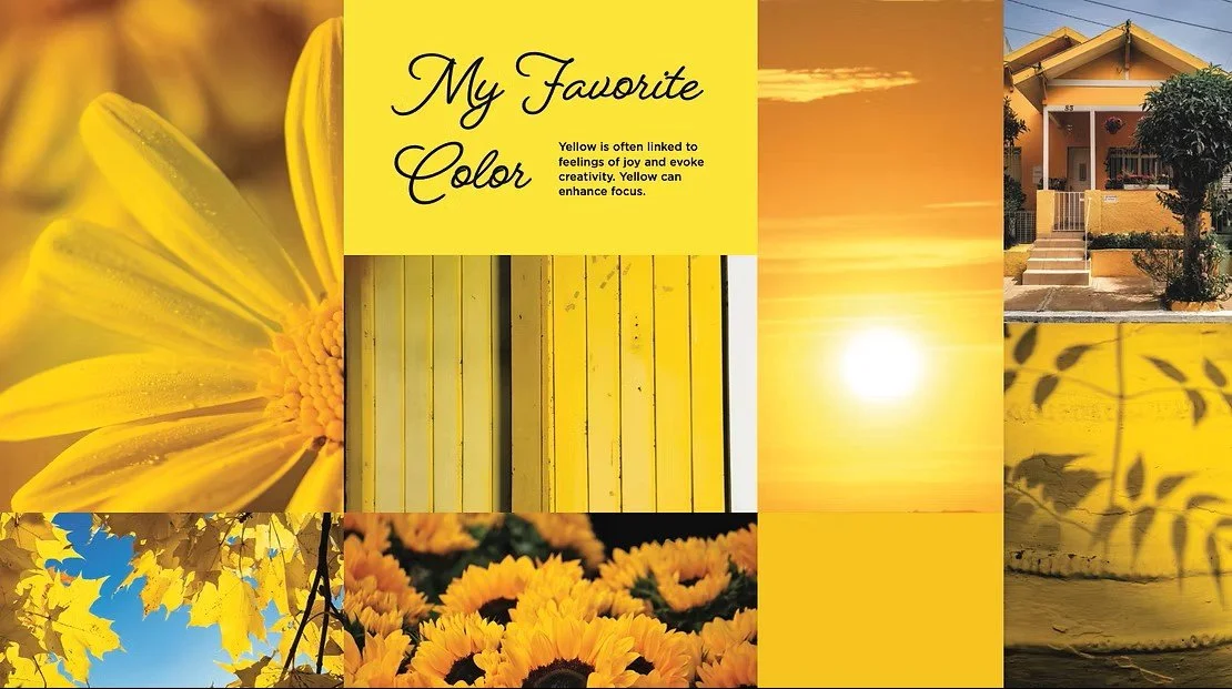
My Favorite: Yellow
If you know me, you know I can’t resist yellow. It’s bright, optimistic, and full of energy. It reminds me of sunlight, fresh flowers, and warmth — all symbols of vitality and positivity.
In design, yellow can be bold and striking, instantly drawing the eye. But it also has a softer side. Used in pastels or paired thoughtfully, it creates a gentle, uplifting mood. Like a sunflower, yellow radiates joy.
Why Color Matters
Every color tells its own story:
Blue conveys trust, calm, and professionalism.
Green represents growth, health, and harmony.
Red sparks energy, urgency, and passion.
Purple feels creative, luxurious, and imaginative.
Black & White bring contrast, clarity, and timeless elegance.
The right palette doesn’t just make a brand look beautiful — it makes it memorable. It sets a mood, communicates values, and creates an emotional connection that people carry with them.
The Takeaway
Color is more than decoration. It’s psychology. It’s strategy. And when used well, it can transform how people experience your brand.
At Nat Marie Design, one of my favorite parts of the branding process is curating palettes that feel both timeless and tailored — palettes that don’t just look good, but feel right.